Branding Themes
Branding themes control the layout, color, and images for the authentication sign-on screens associated with a specified environment. PingOne provides several branding template themes that can be used as-is, or as a starting point for further customization. If a branding theme is not specified, the sign-on screens use Ping Identity default branding.
Branding template configurations
PingOne provides the following branding theme configurations. A branding theme template must be specified in the template property when creating a new branding theme resource:
default
  {
    "name": "default",
    "color": {
      "button": "#2996cc",
      "buttonText": "#ffffff",
      "bodyText": "#686f77",
      "headingText": "#686f77",
      "link": "#2996cc",
      "card": "#ffffff",
      "background": "#ededed"
    },
    "image": {
      "background": ""
    },
    "meta": {
      "displayName": "Ping Default"
    }
  }
focus
{
    "name": "focus",
    "color": {
      "button": "#cb0020",
      "buttonText": "#ffffff",
      "bodyText": "#4a4a4a",
      "headingText": "#cb0020",
      "link": "#2996cc",
      "card": "#fcfcfc",
      "background": "#ededed"
    },
    "image": {
      "background": ""
    },
    "meta": {
      "displayName": "Focus"
    }
  }
mural
{
    "name": "mural",
    "color": {
      "button": "#61b375",
      "buttonText": "#ffffff",
      "bodyText": "#000000",
      "headingText": "#000000",
      "link": "#2996cc",
      "card": "#fcfcfc",
      "background": ""
    },
    "image": {
      "background": "https://assets.pingone.com/ux/branding-themes/0.1.0/mural/bg.jpg"
    },
    "meta": {
      "displayName": "Mural",
      "cssLink": "https://assets.pingone.com/ux/branding-themes/0.1.0/mural/mural.css"
    }
  }
slate
{
    "name": "slate",
    "color": {
      "button": "#fcfcfc",
      "buttonText": "#4a4a4a",
      "bodyText": "#4a4a4a",
      "headingText": "#4a4a4a",
      "link": "#4a4a4a",
      "card": "#fcfcfc",
      "background": ""
    },
    "image": {
      "background": "https://assets.pingone.com/ux/branding-themes/0.1.0/slate/bg.jpg"
    },
    "meta": {
      "displayName": "Slate",
      "cssLink": "https://assets.pingone.com/ux/branding-themes/0.1.0/slate/slate.css"
    }
  }
split
{
    "name": "split",
    "color": {
      "button": "#263956",
      "buttonText": "#ffffff",
      "bodyText": "#263956",
      "headingText": "#686f77",
      "link": "#2996cc",
      "card": "#fcfcfc",
      "background": "#2996cc"
    },
    "image": {
      "background": ""
    },
    "meta": {
      "displayName": "Split"
    }
  }
Branding themes data model
| Property | Type | Required | Mutable | Description |
|---|---|---|---|---|
|
String |
Required |
Mutable |
The background color for the theme. It must be a valid hexadecimal color code, and it is a required property when |
|
String |
Required |
Mutable |
The URL or fully qualified path to the background image file used for branding. This is a required property when |
|
String |
Required |
Immutable |
The ID of the background image. |
|
String |
Optional |
Mutable |
For PingOne Neo verification presentation screen, the outline color of background objects for the branding theme. It must be a valid hexadecimal color code. Defaults to #A5B9C5. |
|
String |
Required |
Mutable |
The background type for the theme. Options are |
|
String |
Required |
Mutable |
The body text color for the theme. It must be a valid hexadecimal color code. |
|
String |
Optional |
Mutable |
The button border color for the theme. It must be a valid hexadecimal color code. |
|
String |
Optional |
Mutable |
The button border radius for the theme (range between 0-25px). |
|
String |
Optional |
Mutable |
The button border width for the theme (range from 0-4px). |
|
String |
Required |
Mutable |
The button color for the theme. It must be a valid hexadecimal color code. |
|
String |
Optional |
Mutable |
The button hover state border color for the theme. It must be a valid hexadecimal color code. |
|
String |
Optional |
Mutable |
The button hover state fill color for the theme. It must be a valid hexadecimal color code. |
|
String |
Optional |
Mutable |
The button hover state text color for the theme. It must be a valid hexadecimal color code. |
|
String |
Required |
Mutable |
The button text color for the branding theme. It must be a valid hexadecimal color code. |
|
String |
Optional |
Mutable |
The button text size for the theme. |
|
String |
Optional |
Mutable |
The button text weight for the theme (range from 100-900). |
|
String |
Optional |
Mutable |
The card border color for the theme. It must be a valid hexadecimal color code. |
|
String |
Optional |
Mutable |
The card border width for the theme (range from 0-4px). |
|
String |
Required |
Mutable |
The card color for the branding theme. It must be a valid hexadecimal color code. |
|
String |
Optional |
Mutable |
The card corner radius for the theme (range from 0-25px). |
|
String |
Optional |
Mutable |
The card horizontal alignment for the theme. |
|
String |
Optional |
Mutable |
The card shadow for the theme. |
|
String |
Optional |
Mutable |
The card vertical alignment for the theme. |
|
String |
Optional |
Mutable |
The focus rectangle color for the theme. It must be a valid hexadecimal color code. |
|
String |
Optional |
Mutable |
The footer of the branding theme. |
|
String |
Optional |
Mutable |
For PingOne Neo verification presentation screen, the highlight color of the foreground object for the branding theme. It must be a valid hexadecimal color code. Defaults to #C6D9FF. |
|
String |
Optional |
Mutable |
For PingOne Neo verification presentation screen, the outline color of the foreground object for the branding theme. It must be a valid hexadecimal color code. Defaults to #4462ED. |
|
String |
Optional |
Mutable |
The global font for the theme. The default value is |
|
String |
Optional |
Mutable |
The header for the theme. For example, |
|
String |
Required |
Mutable |
The heading text color for the branding theme. It must be a valid hexadecimal color code. |
|
String |
Optional |
Mutable |
The input border width for the theme (range from 0-4px). |
|
String |
Optional |
Mutable |
The input box border color for the theme. It must be a valid hexadecimal color code. |
|
String |
Optional |
Mutable |
The input corner radius for the theme (range from 0-25px). |
|
String |
Optional |
Mutable |
The input label position for the theme. |
|
String |
Optional |
Mutable |
The input label text color for the theme. It must be a valid hexadecimal color code. |
|
String |
Optional |
Mutable |
The input label text size for the theme. |
|
String |
Optional |
Mutable |
The input label text weight for the theme (range from 100-900). |
|
String |
Optional |
Mutable |
The input value text color for the theme. It must be a valid hexadecimal color code. |
|
String |
Optional |
Mutable |
The input value text size for the theme. |
|
String |
Optional |
Mutable |
The input value text weight for the theme (range from 100-900). |
|
String |
Required |
Mutable |
The hyperlink text color for the branding theme. It must be a valid hexadecimal color code. |
|
String |
Optional |
Mutable |
The link text hover color for the theme. It must be a valid hexadecimal color code. |
|
String |
Optional |
Mutable |
The link text size for the theme. |
|
String |
Optional |
Mutable |
The link text weight for the theme (range from 100-900). |
|
String |
Required |
Mutable |
The URL or fully qualified path to the logo file used for branding. This is a required property when |
|
String |
Required |
Immutable |
The ID of the logo image. |
|
String |
Optional |
Mutable |
The logo height assigned to the image (range from 0-100px). |
|
String |
Required |
Mutable |
The type of format used for the image. Options are |
|
String |
Required |
Mutable |
The name of the branding theme. |
|
Integer |
Read only |
N/A |
The schema version number for the theme. |
|
String |
Optional |
Mutable |
The subtitle text color for the theme. It must be a valid hexadecimal color code. |
|
String |
Optional |
Mutable |
The subtitle text size for the theme. |
|
String |
Optional |
Mutable |
The subtitle text weight for the theme (range from 100-900). |
|
String |
Optional |
Mutable |
The title text size for the theme. |
|
String |
Optional |
Mutable |
The title text width for the theme (range from 100-900). |
|
String |
Optional |
Mutable |
The application background color for the theme. It must be a valid hexadecimal color code. Note that this property is not used by DaVinci forms. |
|
String |
Optional |
Mutable |
The header background color for the theme. It must be a valid hexadecimal color code. Note that this property is not used by DaVinci forms. |
|
Object |
Optional |
Mutable |
The localization object to specify language translations for the form header. |
|
String |
Optional |
Mutable |
The localization language code for the header’s default language (for example, |
|
Object |
Optional |
Mutable |
The localization language object that specifies the localized text and content type for the language options. |
|
Object |
Optional |
Mutable |
The localization language object that specifies the localized text and content type for the specific language. |
|
String |
Optional |
Mutable |
The header text in the specified language. |
|
String |
Optional |
Mutable |
The content type for the header text in the specified language. Options are |
|
Object |
Optional |
Mutable |
The localization object to specify language translations for the form footer. |
|
String |
Optional |
Mutable |
The localization language code for the footer’s default language (for example, |
|
Object |
Optional |
Mutable |
The localization language object that specifies the localized text and content type for the language options. |
|
Object |
Optional |
Mutable |
The localization language object that specifies the localized text and content type for the specific language. |
|
String |
Optional |
Mutable |
The footer text in the specified language. |
|
String |
Optional |
Mutable |
The content type for the footer text in the specified language. Options are |
|
Boolean |
Required |
Mutable |
Indicates whether this theme is the environment’s default branding configuration. This is used when no theme is specifically associated with an authentication flow. Only one theme can be the default at any time. |
|
String |
Required |
Immutable |
The environment resource’s unique identifier associated with the branding theme. |
|
String |
Required |
Immutable |
The ID of the branding configuration resource. |
|
String |
Required |
Mutable |
The template name of the branding theme associated with the environment. Options are |
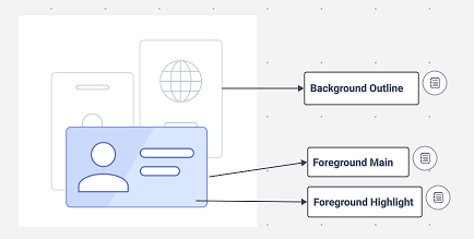
Locations of configuration attributes backgroundOutlineColor, foregroundMainColor, and foregroundHighlightColor in the PingOne Neo Verify application.
Response codes
| Code | Message |
|---|---|
200 |
Successful operation. |
201 |
Successfully created. |
400 |
The request could not be completed. |
401 |
You do not have access to this resource. |
403 |
You do not have permissions or are not licensed to make this request. |
404 |
The requested resource was not found. |
500 |
Unexpected server error. |