API reference
This page lists the modules that the Advanced Identity Cloud/PingAM Login Widget provides for use in your apps.
Widget
This is a compiled Svelte class. This is what instantiates the component, mounts it to the DOM, and sets up all the event listeners.
import Widget from '@forgerock/login-widget';

// Instantiate Widget
const widget = new Widget({
  target: widgetRootEl, // REQUIRED; Element mounted in DOM
  props: {
    type: 'modal', // OPTIONAL; "modal" or "inline"; "modal" is default
  },
});

// OPTIONAL; Remove widget from DOM and destroy component listeners
widget.$destroy();|
Call We strongly encourage you to instantiate the modal form factor of the Advanced Identity Cloud/PingAM Login Widget high up in your application code. Instantiate it close to the top-level file in a component that is created once and preserved. |
Configuration
The Advanced Identity Cloud/PingAM Login Widget requires the URL of your server’s .well-known/openid-configuration endpoint. If you use OAuth/OIDC tokens, user info, or logout, it also requires an OIDC client configuration.
For information on setting up your server for use with the Advanced Identity Cloud/PingAM Login Widget, refer to Prerequisites.
To provide these settings, import and await the async configure() function. Call it once at the top level of your application, before any other Widget API.
import { configure } from '@forgerock/login-widget';

// configure() is async, so await it before calling any other Widget API
await configure({
  // REQUIRED; the well-known URL, shared by the journey and OIDC clients
  serverConfig: {
    wellknown: 'https://openam-forgerock-sdks.forgeblocks.com/am/oauth2/realms/root/realms/alpha/.well-known/openid-configuration',
  },
  // REQUIRED if you use OAuth/OIDC tokens, user info, or logout
  oidcClient: {
    clientId: 'sdkPublicClient',
    redirectUri: `${window.location.origin}/callback`,
    // OPTIONAL; defaults to 'openid'
    scope: 'openid profile email address',
  },
  // OPTIONAL; see dedicated sections below
  logger: {},
  middleware: [],
  storage: {},
  captcha: {},
  content: {},
  journeys: {},
  links: {},
  style: {},
});|
|
Content configuration options
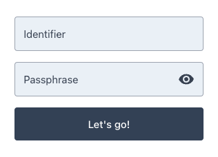
Use the content configuration element to pass custom text content to the Advanced Identity Cloud/PingAM Login Widget, replacing its default values.
You can use this method to localize user interface text for different regions. Learn more in Localizing the widget.
content configurationawait configure({
serverConfig: { wellknown: 'https://openam-forgerock-sdks.forgeblocks.com/am/oauth2/realms/root/realms/alpha/.well-known/openid-configuration' },
content: {
userName: 'Identifier',
passwordCallback: 'Passphrase',
nextButton: "Let's go!",
},
});
For a list of the content you can override, refer to the en-us locale file in the Advanced Identity Cloud/PingAM Web Login Framework repository.
Links configuration options
Use the links configuration element to set the full canonical URL to your terms and conditions page.
This should be a page hosted on your website or elsewhere within your app. Users are sent to this URL if they click to view the terms and conditions in the Advanced Identity Cloud/PingAM Login Widget.
This supports the TermsAndConditionsCallback often used in registration journeys.
links configurationawait configure({
serverConfig: { wellknown: 'https://openam-forgerock-sdks.forgeblocks.com/am/oauth2/realms/root/realms/alpha/.well-known/openid-configuration' },
links: {
termsAndConditions: 'https://example.com/terms',
},
});Style configuration options
Use the style configuration element to configure the look and feel of the Advanced Identity Cloud/PingAM Login Widget.
For full guidance, including examples and screenshots, see Configuring style properties.
await configure({
  serverConfig: { wellknown: 'https://openam-forgerock-sdks.forgeblocks.com/am/oauth2/realms/root/realms/alpha/.well-known/openid-configuration' },
  style: {
    checksAndRadios: 'animated',
    labels: 'floating',
    showPassword: 'button',
    logo: {
      dark: 'https://example.com/img/white-logo.png',
      light: 'https://example.com/img/black-logo.png',
      height: 300,
      width: 400,
    },
    sections: {
      header: false,
    },
    stage: {
      icon: true,
    },
    theme: {
      primaryColor: '#f46200',
      secondaryColor: '#003049',
      backgroundColor: '#ffffff',
      linkColor: '#f46200',
      fontFamily: 'Inter, sans-serif',
      buttonBorderRadius: 8,
      cardBorderRadius: 12,
    },
  },
});| Property | Values | Description |
|---|---|---|
|
|
Controls the rendering style of checkboxes and radio buttons. |
|
|
Controls label positioning. |
|
|
Controls how the password visibility toggle is rendered.
|
| Property | Description |
|---|---|
|
Full URL to the logo image for use in light mode. |
|
Full URL to the logo image for use in dark mode. |
|
Number of pixels for the logo height. |
|
Number of pixels for the logo width. |
|
It accepts separate To apply a single logo regardless of color scheme, use |
| Property | Description |
|---|---|
|
Boolean. Set to |
| Property | Description |
|---|---|
|
Boolean. Set to |
| Property | Description |
|---|---|
|
Hex color values (6 or 8 digit, for example |
|
Hex color value for the widget’s secondary brand color. |
|
Hex color for the page or modal background. |
|
Hex colors for card background and text. |
|
Hex color for general body text within the widget. |
|
Hex colors for links in their default and active states. |
|
Hex colors for form input background, border, label, and text. |
|
Hex color for the focus ring on form inputs. |
|
Hex colors for |
|
Hex color for button text. |
|
Hex color for the focus ring on buttons. |
|
A CSS font family string, for example |
|
Full URL or base64 data URI to override the logo image. Applies a single logo regardless of color scheme. For separate light and dark variants, use |
|
Number of pixels for the logo height. |
|
Full URL for the browser tab icon. |
|
Numbers, in pixels, controlling the corner rounding of buttons and cards. |
|
|
Journeys configuration options
Use the journeys configuration element to map HREF values rendered within the Advanced Identity Cloud/PingAM Login Widget to start a journey or authentication tree instead of visiting the URL.
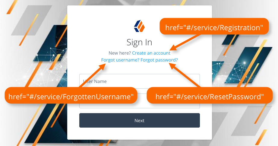
The Advanced Identity Cloud/PingAM Login Widget listens for click events on elements rendered within its container and compares the HREF to the configured mappings. If there is a match, it prevents the default action of visiting the URL and starts the journey configured in the mapping.
await configure({
  serverConfig: { wellknown: 'https://openam-forgerock-sdks.forgeblocks.com/am/oauth2/realms/root/realms/alpha/.well-known/openid-configuration' },
  journeys: {
    forgotPassword: {
      journey: 'ResetPassword', // Must match actual journey name in the server
      match: ['#/service/ResetPassword'], // Array of strings that match `HREF` values (case-sensitive)
    },
  },
});
The Advanced Identity Cloud/PingAM Login Widget has mappings configured internally to handle the links displayed in page nodes by default. These map the HREF values that are displayed by an out-of-the-box page node to corresponding journeys in an PingOne Advanced Identity Cloud tenant. You can override the mappings if required.
forgotPassword: {
    journey: 'ResetPassword',
    match: ['#/service/ResetPassword', '?journey=ResetPassword'],
},
forgotUsername: {
    journey: 'ForgottenUsername',
    match: ['#/service/ForgottenUsername', '?journey=ForgottenUsername'],
},
login: {
    journey: 'Login',
    match: ['#/service/Login', '?journey', '?journey=Login'],
},
register: {
    journey: 'Registration',
    match: ['#/service/Registration', '?journey=Registration'],
},
CAPTCHA configuration
AM does not signal invisible mode in the callback payload for either ReCaptchaCallback or ReCaptchaEnterpriseCallback. Use the captcha option to configure invisible rendering:
await configure({
  serverConfig: { wellknown: 'https://openam-forgerock-sdks.forgeblocks.com/am/oauth2/realms/root/realms/alpha/.well-known/openid-configuration' },
  captcha: {
    mode: 'invisible', // 'visible' (default) | 'invisible'
  },
});
Refer to Implement a CAPTCHA for more information.
Component
Use the component module for subscribing to modal and inline form factor events and for opening and controlling the modal form factor.
Call the component() method and assign the result to a variable to receive the observable. Subscribe to the observable to listen and react to the state of the Advanced Identity Cloud/PingAM Login Widget component.
import { component } from '@forgerock/login-widget';

// Initiate the component API
const componentEvents = component();

// Know when the component, both modal and inline has been mounted.
// When using the modal type, you will also receive open and close events.
// The property `reason` will be either "auto", "external", or "user"

const unsubComponentEvents = componentEvents.subscribe((event) => {
    /* Run anything you want */
});

// Open the modal
componentEvents.open();

// Close the modal
componentEvents.close();

// Recommended: call when your UI component is destroyed
unsubComponentEvents();
Schema for component events
The schema for component events is as follows:
component events{
lastAction: null, // null or the most recent action; one of `close`, `open`, or `mount`
error: null, // null or object with `code` and `message` properties
mounted: false, // boolean
open: null, // boolean for the modal form factor, or null for inline form factor
reason: null, // string to describe the reason for the event
}Use the reason value to determine why the modal has closed.
The possible reason values are:
user-
The user closed the dialog within the UI
auto-
The modal was closed because the user successfully authenticated
external-
The application called the
close()function
Journey
Use the journey module to manage interaction with authentication and self-service journeys.
import { journey } from '@forgerock/login-widget';

// Call to start the journey
// Optional config can be passed in, see below for more details
const journeyEvents = journey({
  oauth: true, // OPTIONAL; defaults to true; uses OAuth flow for acquiring tokens
  user: true, // OPTIONAL; default to true; returns user information from `userinfo` endpoint
});

// Start a journey
journeyEvents.start({
  journey: 'Login', // OPTIONAL; specify the journey or tree you want to use
  query: {}, // OPTIONAL; additional query parameters to include when starting the journey
  resumeUrl: window.location.href, // OPTIONAL; the full URL for resuming a suspended journey
  recaptchaAction: 'myCaptchaTag', // OPTIONAL; tag reCAPTCHAs. Falls back to journey name.
});

// Change to a different journey
journeyEvents.change({
  journey: 'Registration',
});

// Subscribe to journey events
const unsubJourneyEvents = journeyEvents.subscribe((event) => {
  /* Run anything you want */
});

// Recommended: call when your UI component is destroyed
unsubJourneyEvents();|
PingOne Protect risk evaluations are initialized separately via |
Schema for journey events
The schema for journey events is as follows:
journey events{
journey: {
completed: false, // boolean
error: null, // null or object when the journey fails:
// {
// code: null, // number; HTTP status code, e.g. 401
// message: null, // string; human-readable failure reason
// stage: null, // string; page node stage value, if set
// troubleshoot: null, // always null; reserved for future use
// detail: null, // object; extra detail from the server, e.g. { failureUrl: 'https://...' }
// }
loading: false, // boolean
step: null, // null or object with the last step object from the server
successful: false, // boolean
response: null, // null or object if successful containing the success response from the server
},
oauth: {
completed: false, // boolean
error: null, // null or object with `code` (optional), `message`, and `troubleshoot` properties
loading: false, // boolean
successful: false, // boolean
response: null, // null or object with OAuth/OIDC tokens
},
user: {
completed: false, // boolean
error: null, // null or object with `code` (optional), `message`, and `troubleshoot` properties
loading: false, // boolean
successful: false, // boolean
response: null, // null or object with user information driven by OAuth scope config
},
}User
Use the user module to access methods for managing users:
-
user.info -
user.tokens -
user.logout
The user.info and user.tokens methods require use of OAuth 2.0, so you must configure oidcClient in your call to configure().
The user.info method also requires a scope value of openid, which is the default.
You can use user.logout with both OAuth 2.0 and session-based authentication.
import { user } from '@forgerock/login-widget';

/**
 * User info API
 */
const userEvents = user.info();

// Subscribe to user info changes
const unsubUserEvents = userEvents.subscribe((event) => {
  // Return current, *local*, user info and future state changes
  console.log(event);
});

// Fetch/get fresh user info from the server
userEvents.get(); // New state is returned in your `userEvents.subscribe` callback function

/**
 * User tokens API
 */
const tokenEvents = user.tokens();

// Subscribe to user token changes
const unsubTokenEvents = tokenEvents.subscribe((event) => {
  // Return current, *local*, user tokens and future state changes
  console.log(event);
});

// Return existing user tokens if available and not expired or about to expire
// Otherwise obtain fresh ones from the server
tokenEvents.get(); // State is returned in your `tokenEvents.subscribe` callback function

/**
 * Logout
 * Log user out and clear user data (info and tokens)
 */
user.logout(); // Resets user and emits event to your info and tokens' `.subscribe` callback function

// Recommended: call when your UI component is destroyed
unsubUserEvents();
unsubTokenEvents();
To force the Advanced Identity Cloud/PingAM Login Widget to obtain fresh tokens from the server rather than returning cached tokens:
tokenEvents.get({ forceRenew: true });Schema for user.info events
The schema for user.info events is as follows:
user.info events{
completed: false, // boolean
error: null, // null or object with `code` (optional), `message`, and `troubleshoot` properties
loading: false, // boolean
successful: false, // boolean
response: null, // object returned from the `/userinfo` endpoint
}Schema for user.tokens events
The schema for user.tokens events is as follows:
user.tokens events{
completed: false, // boolean
error: null, // null or object with `code` (optional), `message`, and `troubleshoot` properties
loading: false, // boolean
successful: false, // boolean
response: null, // object returned from the `/access_token` endpoint
}Protect
Use the protect module to manually control the PingOne Signals SDK: starting data collection, returning collected data, and pausing or resuming behavioral data capture.
Refer to Step 2. Configure the Advanced Identity Cloud/PingAM Login Widget for PingOne Protect for full details and code examples.
Calling protected resources
The Advanced Identity Cloud/PingAM Login Widget does not provide an HTTP client for calling protected resources.
To call a protected endpoint, get the current access token from user.tokens().get() and call fetch() yourself, adding the Authorization header:
import { user } from '@forgerock/login-widget';

const tokenEvents = user.tokens();
const { response: tokens } = await tokenEvents.get();

const response = await fetch('https://protected.resource.com', {
  method: 'GET',
  headers: {
    Authorization: `Bearer ${tokens.accessToken}`,
  },
});|
Earlier versions of the Advanced Identity Cloud/PingAM Login Widget exposed a Refer to Breaking changes for more information. |